


color theory: wearables
Did you know there's a whole psychology behind colors? I didn't either, but I always knew that there were colors that would almost effect your mood. Like in certain places you might feel relaxed and calm? While doing some research on colors, I found that interior designers, artists, and even Pablo Picasso believe that color can drastically affect moods, feelings, and emotions.
I dove deep into a rabbit hole of color psychology and discovered that there's even psychological effects on warm and cool colors. Warm colors can spark comfort and warmth while cool colors bring out calmness. (excuse me while I repaint my house now).
Let's break down our summer tonals with their psychological effects! Maybe you'll find a color you'll need to make your next sweater or blanket out of to spark a new feeling!
White/Cream/Beige

Neutral colors have always been one of my favorites - they just go so well with everything! After researching, it makes sense! Whites, creams, and beige bring out feelings of cleanliness, innocence, purity, and a sense of space.
|
The color of sand dunes and the faded beige color of the grasses that grow among them. The perfect color for neutral lovers. |
A barely there blush pink reminiscent of a pearl hidden inside an oyster. This one shines in the seaside sun. |
Gray

Neutral, timeless, and practical are all words to describe the psychology of the color gray. I guess now I understand why my living room is mostly gray lol! With our summer tonal, we have the perfect gray/beige blend for that timeless, staple in your wardrobe.
|
A weathered grey taupe that is a perfect mix of warm and cool tone. It looks like it's been in the sun and gives a laid back beachy vibe.
|
A silvery grey like rocks worn smooth by the surf.
|
Yellow

I am always a big fan of yellow, but the one in our summer tonal collection is just the perfect one! If you find yourself gravitating towards it, yellow brings out feelings of happiness, laughter, warmth, and optimism.
|
A soft glowy yellow that's a faded kind of sunny. For those of us that like yellow if it's soft and barely off neutral.
|
Green

Green is considered restful because the eye focuses on the color green directly on the retina - which is less strainful on your eye muscles. Green is also known to bring feelings of growth, tranquility, harmony, and calmness. I think more green is needed in my home...
|
A fresh olive green weathers to sandy brown within the dunes of the beach.
|
Blue
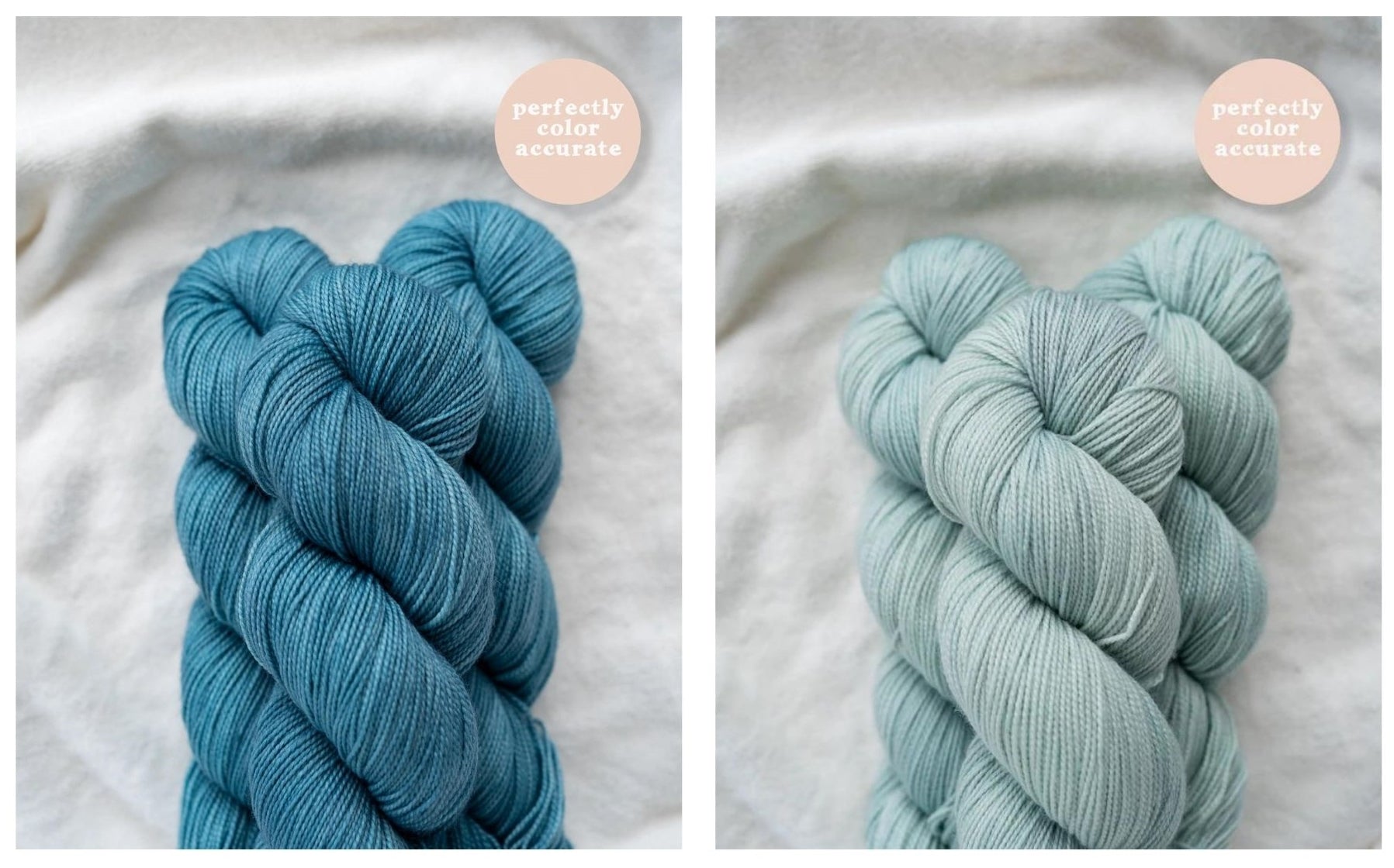
Blue colors play a major role in relaxation. Blue is typically a calming color and is said to decrease respiration and even lower your blood pressure. This color brings out feelings of calmness, serenity, loyalty, and increases focus.
|
The color of the ocean as the sky meets the sea. A slightly tropical hue that's as calming as it is vibrant. |
Equal parts bright and serene, this faded aqua blue looks as though it came straight from the sea. It shines in the sunlight and adds a spot of brightness to a faded neutral palette. |
Brown

Brown is the color that makes you feel secure, comfortable, reliable, and stable.
|
Warm wood tones weathered to include sandy grey. It's a brown that plays well with others and offers a slightly more saturated neutral to round out the palette.
|
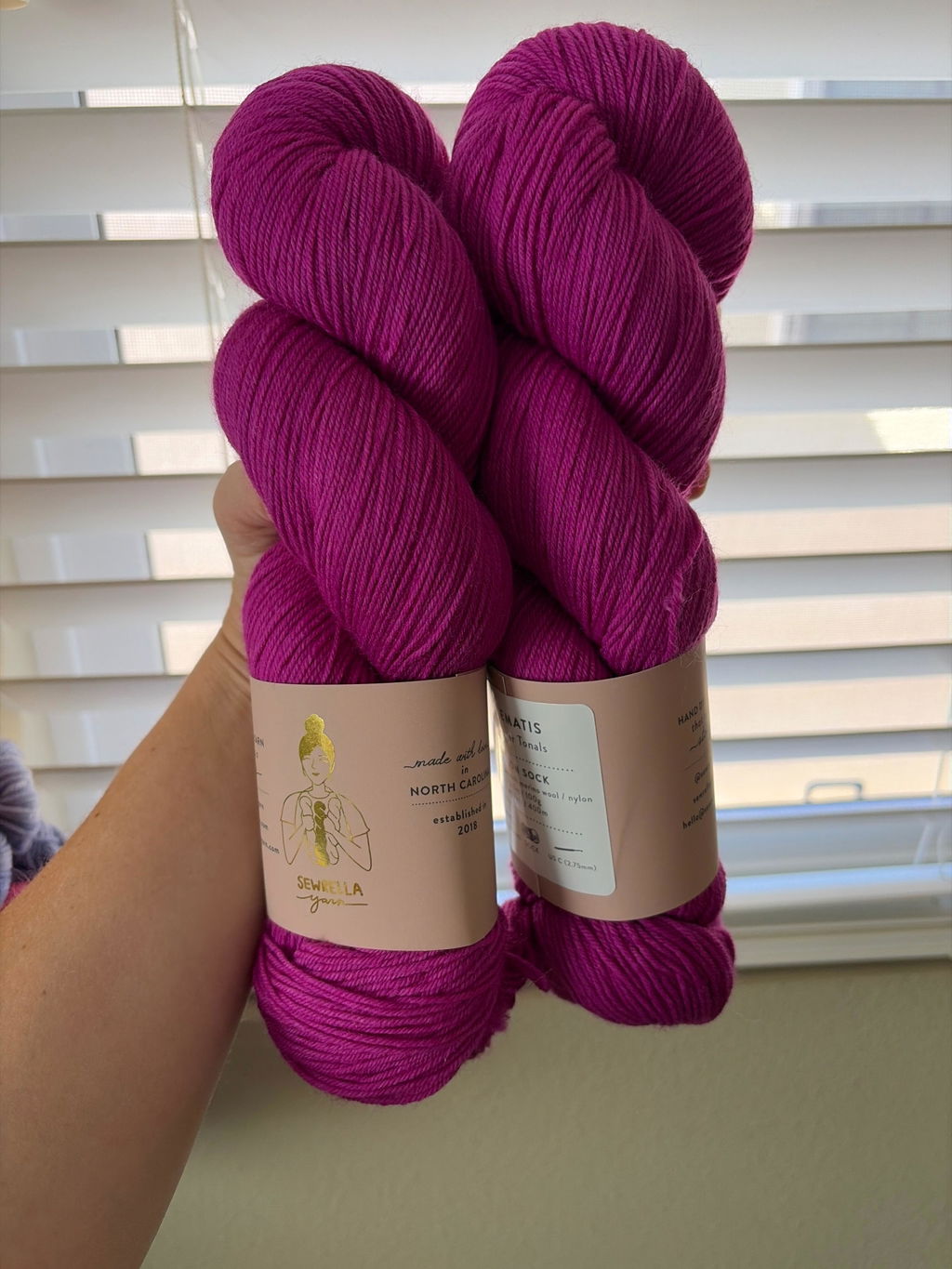
Pink

Pink (especially every Sewrella pink) is my all time favorite color. Pink brings out feelings of romance, love, and calming.
|
Feminine and breezy, this pink has a rosy blush hue that reminds us of vintage bathing beauties.
|
Leave a comment